Four Audiences Share One Homepage. Only One Can Win It.
Someone deciding where to apply, someone already enrolled looking for a timetable, a parent checking a term date, and a member of staff after an internal form — all four arrive at the same address wanting completely different things. The usual compromise is a navigation that serves all four equally, which serves none of them, and it is chosen because deciding is uncomfortable rather than because it works.
No credit card required · 30-minute call · No obligation to sign up

Six visits that need completely different pages
Each of these is a real, frequent visit. The question is not whether to serve all of them — you must — but which one the homepage is built for and how quickly the others get out of it.
- Deciding whether to applyWants persuasion, and time to read
- Already enrolled, needs a timetableWants one link and no persuasion at all
- A parent checking a dateOn a phone, in about twenty seconds
- Staff after an internal formShould not be on the public site
- An applicant mid-processWants status, not a prospectus
- Somebody checking a closureAt 7am, and everything else is noise
The last row is the one that decides how the homepage is really judged. On the morning of a closure or an emergency, the site has a single job, and everything designed for the other five visits is in the way. Designing that state deliberately — a banner that takes over, prepared in advance — is a small piece of work that is impossible to improvise on the day.
Serving everyone equally is a decision not to decide
In practice the homepage should usually belong to the person deciding whether to apply, because that is the visit where the site changes the outcome. Current students and staff are going to find what they need regardless — they visit often, they know where things are, and a prominent, boring, always-in-the-same-place link serves them better than a share of the front page ever will. That arrangement feels unbalanced in a stakeholder meeting and works considerably better in practice.
The corollary is that the internal audience should mostly not be on the public site at all. Staff forms, policies for internal use and student services that require a login belong behind one, reached from a single obvious entry point. Every internal link on a public homepage is a piece of the front door spent on somebody who was not deciding anything.
Term dates, closures and news are the three things a returning visitor looks for, and they are also the three things most likely to be out of date, because they are edited by whoever has time. The build should make them the easiest possible things to update — a form with three fields rather than a page in a rich text editor — because an update that requires knowing how the CMS works is an update that does not happen at half term.
Accessibility deserves more weight here than in most sectors, and for a straightforward reason: the audience contains a higher proportion of people using assistive technology, and many providers operate under obligations that make it a requirement rather than a preference. Built into the specification it is ordinary work. Bolted on afterwards it is an audit and a list of defects, and in this sector the list is usually long because the site accumulated pages from many hands.
- ✓The front door belongs to applicants — The other three will find what they need anyway. That is the trade.
- ✓Internal audiences go behind a login — Every internal link on the homepage is front door spent on nobody.
- ✓Make dates trivially editable — Three fields, not a rich text editor. Otherwise they go stale at half term.
- ✓Design the closure state in advance — On that morning the site has one job. It cannot be improvised.
- ✓Accessibility in the specification — Higher proportion of assistive-technology users, and often an obligation.
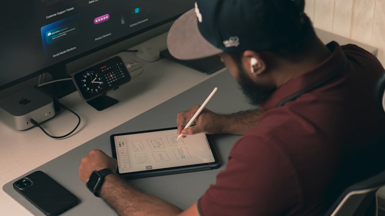
A navigation that serves four audiences equally is not a compromise. It is a decision nobody wanted to make.
What an education build has to resolve
Six things, and the first is a decision rather than a feature.
Name the Primary Audience
Written down and agreed before design starts, because every later argument about the homepage is really this argument. Usually applicants, and usually uncomfortable.
Internal Behind One Door
Staff forms, internal policies and anything needing a login reached from a single obvious entry point rather than scattered across the public navigation.
Dates You Can Actually Update
Term dates and closures behind a three-field form, not a page in a rich text editor. The measure of success is whether they are correct in the last week of term.
A Closure State, Prepared
A takeover banner designed and tested before it is needed. On the morning it matters the site has one job and nobody has time to invent the layout.
Accessibility in the Specification
Semantic structure, keyboard operability and real contrast decided with the design. In this sector the retrofit list is always long, because the site was built by many hands.
Course Pages From One Source
Entry requirements, fees and duration held once and shown everywhere they appear. The alternative is three versions of the same course and a complaint about the one that was wrong.
What clients say
Real clients, quoted in their own words — published with their permission.
“It was a pleasure working with Ghalib and his team.”
“Ghalib’s clear guidance has helped improve our website’s SEO performance.”
“We’re very thankful to Ghalib and his team for building a fully-functioning website for our business.”
More of them, in full, on our reviews page.
— Our Proprietary Methodology —
The Visibility Framework™, applied in Education
The method doesn’t change by market. What it’s pointed at does.
Audit & Discovery
What the current site earns, where it leaks, what your competitors do better, and what the new one must achieve. Ends in a written scope and a fixed price — not an estimate that grows.
Structure & Design
Sitemap, wireframes and user journeys agreed before decoration, then a design system applied consistently. You approve the shape before we make it beautiful.
Build & Test
Front end, back end, CMS and integrations, on a staging site you can see from day one. Tested on real devices, real screen readers and real slow connections.
Launch & Improve
Redirects verified, analytics connected, handover recorded — then we look at what real visitors actually do and fix what the design assumed wrongly.
Honest, No-Nonsense Commitment
The price we quote after discovery is the price you pay — if we underestimated the work, that is our problem, not a change request. And on any rebuild, if organic traffic drops because of something we did at migration, we fix it at our cost, however long it takes.
Website Development pricing for Education, in USD
Quoted per build. The audience decision is part of the work rather than a preliminary, because it is the thing every later disagreement traces back to — and it is much cheaper to have that argument once, early, with everyone in the room.
Single Site
One school or training provider.
- Primary audience named and designed for
- Term dates and closures editable in seconds
- Accessibility in the specification
College
The usual one. Courses, departments, applicants.
- Everything in Single Site
- Course data held once, shown everywhere
- Internal audience behind one entry point
- Optional: bundle in SEO or Social Media
Group or Trust
Multiple sites under shared governance.
- Shared components, local content per site
- Central policies with per-site overrides
- Coordinated closure and emergency states
- Optional: combine all 4 services for full-funnel growth
Every plan is scoped around your market — get a free audit and we’ll recommend what fits, priced in USD.
What you’re actually committing to
Most agencies keep this in a contract you only see after the sales call. We would rather you knew now, because it is the question everyone asks second — right after the price.
- A fixed price, agreed before we startQuoted after discovery, not estimated on a call. If the work takes longer than we thought, that is our risk — the price does not move unless you change the scope.
- 50% to begin, 50% at launchNo large upfront payment held for months, and nothing owed until the site is live and you have seen it working.
- You own everythingDomain, hosting, code repository, design files and content — all in your name from day one, and still yours if we never work together again.
- No proprietary lock-inStandard, widely-used technology only. Any competent developer can take the site over, and nothing stops working because you stopped paying us.
- Two rounds of revisions per stageIncluded at wireframe and design stage, where changes are cheap. Beyond that, or after sign-off, changes are quoted before any work starts.
- 30 days of support after launchBugs and small tweaks included as standard. A care plan afterwards is optional, never automatic, and cancellable with 30 days’ notice.
These are the terms as they appear in the agreement itself — nothing here is softened for the website. The full wording lives in our terms and conditions, and you get the agreement to read before anything is signed or invoiced.
Education Website Development questions, answered
Related Website Development pages
Same service, different angle — by market, by discipline and by platform.
Ready to decide who owns the front door?
Free 30-minute audit · No obligation · Response within 24 hours
Get in touch with Ghalib Ashrafi HQ
Ghalib Ashrafi takes on work for brands in six markets — the UK, USA, UAE, Saudi Arabia, Australia and Pakistan. Every enquiry gets a reply within 24 hours.